Typography can make or break your visual content
Type stingers are short, impactful statements that work with the visual and support the brand message. By layering text over AI-generated artwork, you can create dynamic live compositions that let you rapidly experiment with designs.
Change up the norm and iterate
Rotate, add gradients, and experiment with text arrangements. Iterate fast and don't be afraid to try new things.
Typography cheat codes
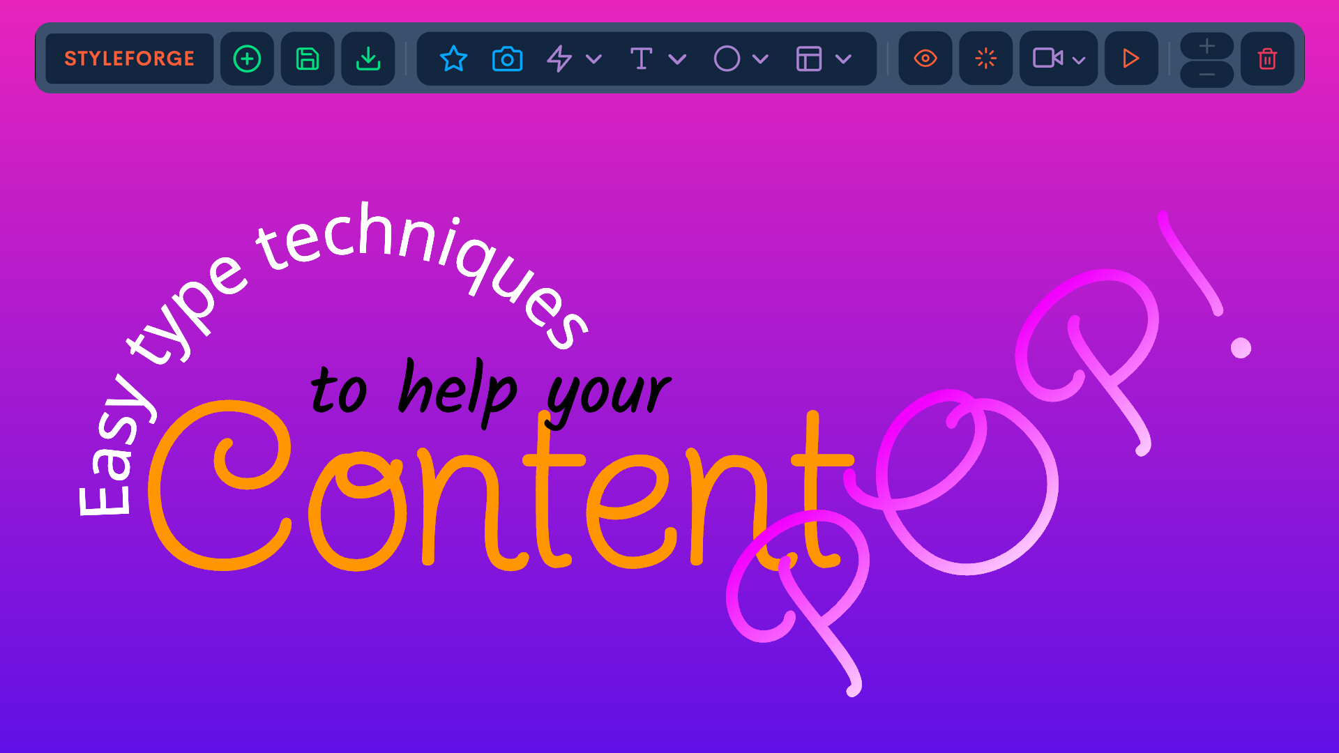
Adding opacity, glows, angles and layering effects are easy cheat codes with typography. Try our colorize text effect.
The art of creating effective type stingers lies in understanding how text and imagery can work together. When done right, your type becomes an integral part of the visual story, not just words on top of an image. The key is to find natural spaces within your AI-generated artwork where text can live comfortably while adding visual interest.
Start with simple compositions and gradually build complexity. Look for areas in your image with less detail or consistent color to place your primary text elements. Then, experiment with layering additional type elements at different opacities to create depth and visual interest.
Essential Techniques
Color Harmony
Use color pickers to extract colors directly from AI artwork
Apply opacity to create subtle color blending
Layer text with varying opacities for depth
Visual Balance
Create interesting angles for dynamic compositions
Combine complementary fonts for visual interest
Keep messaging concise and impactful
The most effective type stingers often emerge from experimentation. Try different font combinations, adjust sizing dramatically, and play with rotations to find unexpected compositions. Remember that contrast is key – both in color and scale. A mix of large and small text elements creates hierarchy and guides the viewer's eye through your design.
Consider your type stingers as design elements that can frame, flow around, or integrate with your AI-generated artwork. The goal is to create a seamless blend where typography and image support each other, rather than competing for attention.
Practical Examples
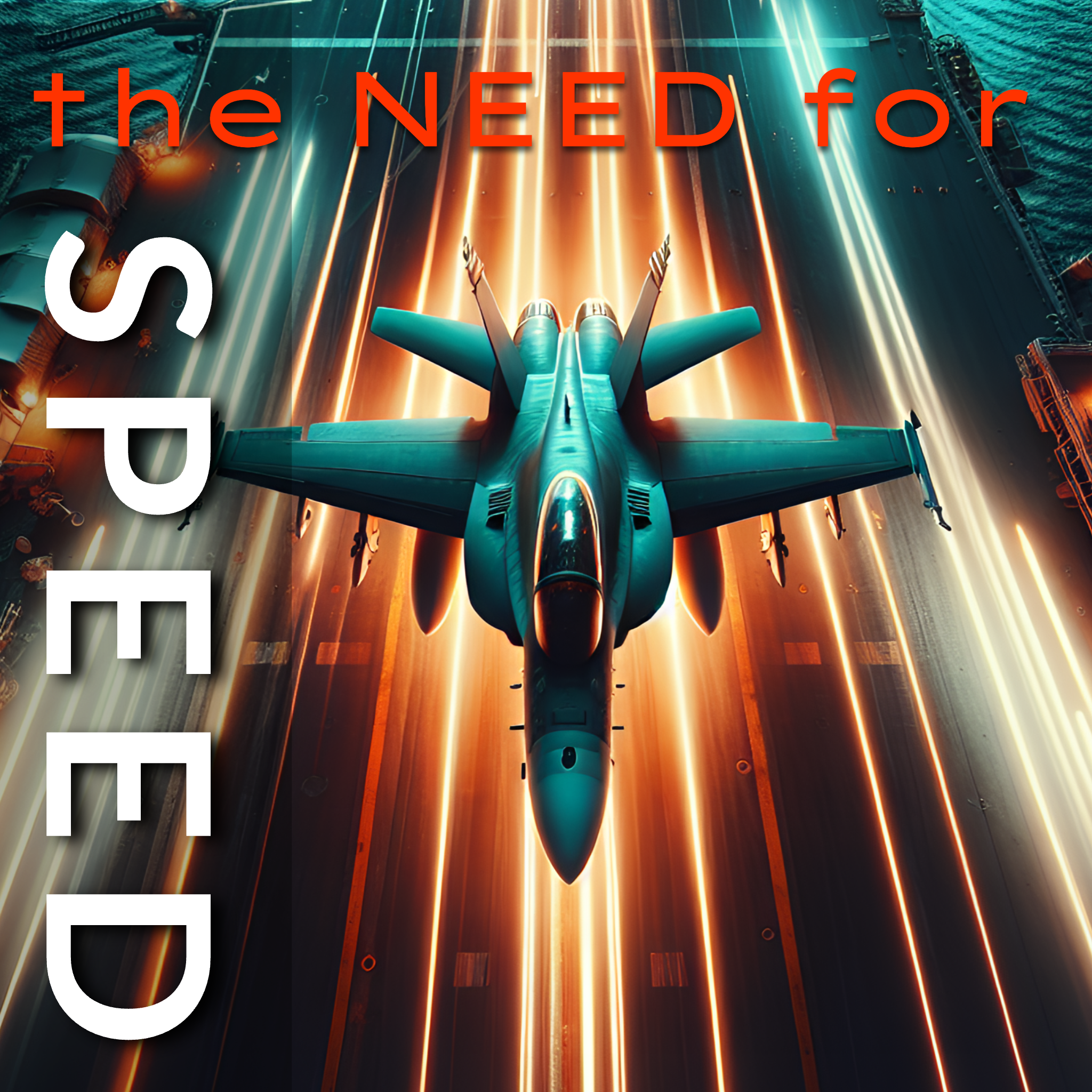
Drop Shadows & Glows
Use drop shadows and colored glows for emphasis. Offset the vertical and horizontal shadow for added depth and interest.
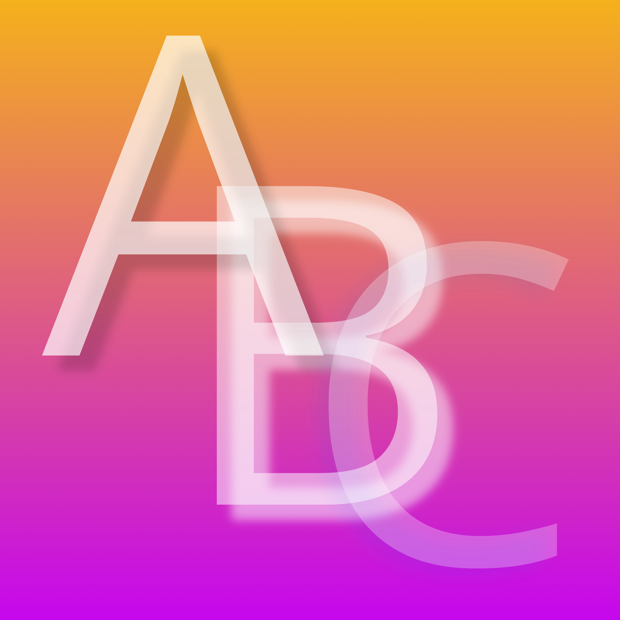
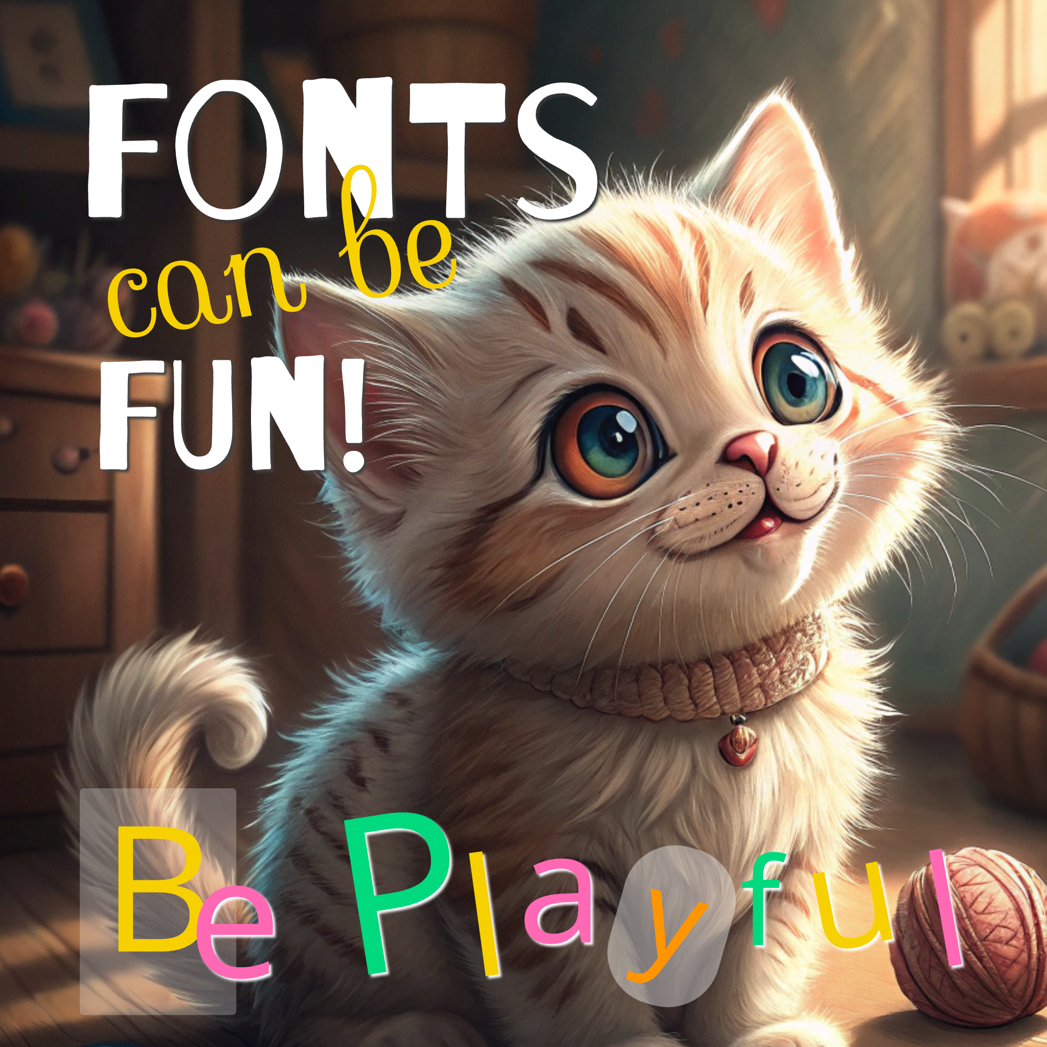
Reduce Opacity & Overlap
Overlap text elements with lower opacity for depth, try using a white drop shadow with vertical offsets. Send elements behind each other for a layered effect.
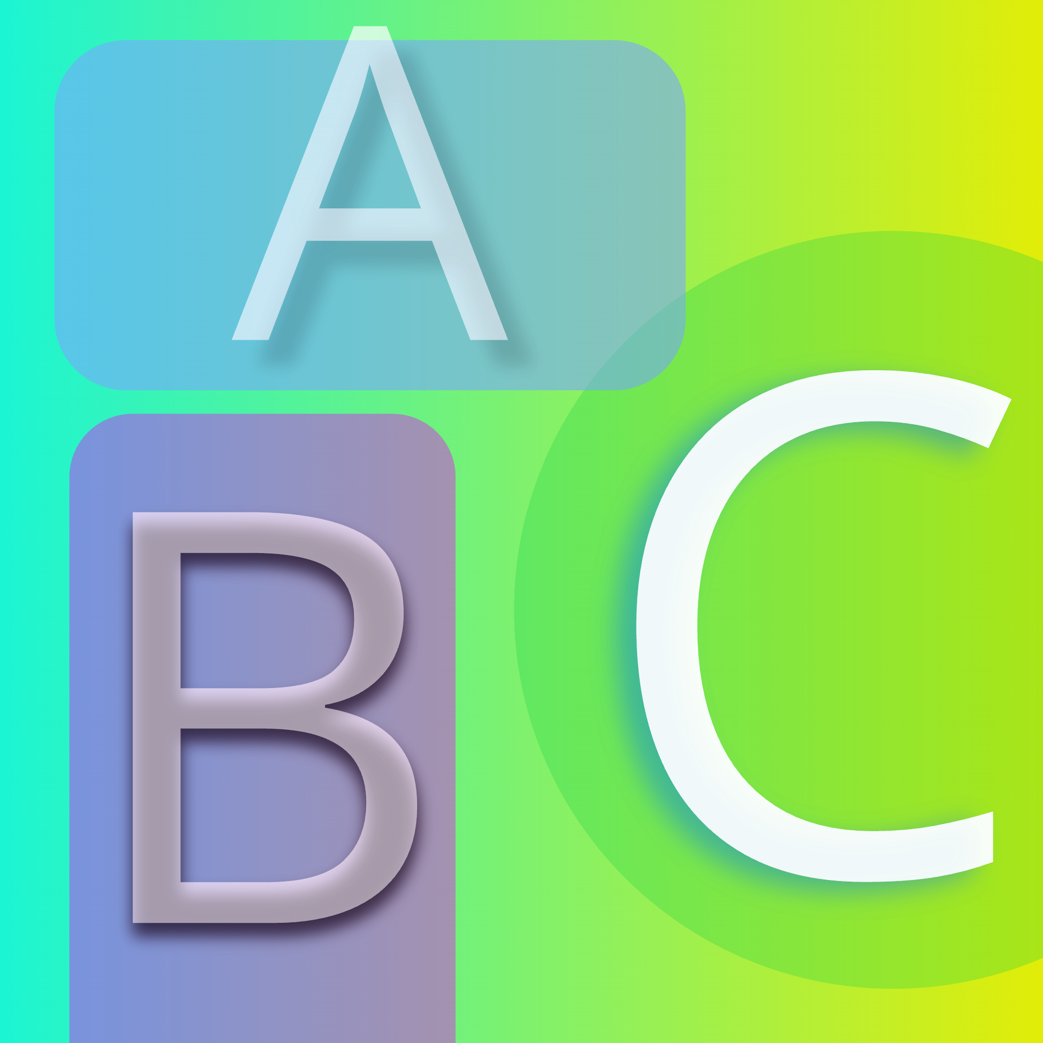
Creative Alignment
Use shapes and align type creatively for impact. Apply the background fill to text for blocks that surround the type. Lower the background opacity to let the AI artwork show through.
We make creating with type fast and fun.
StyleForge.io is built for exploring designs fast. Click an image, create a variation, clone and modify layouts instantly, test different variations while keeping your original intact.
Our infinite canvas design workspace gives you unlimited space to drag elements to the side and play around with different looks. Anything on the canvas can be downloaded in a single click. We trim out steps, hate menus and hunting for stuff when we work, so we designed our canvas to flow.
Each layout exists on its own dedicated canvas, providing a structured yet flexible environment for managing design variations. We know the pains of making great design. It takes experimenting to find the right combination of elements that work together. We built StyleForge to make that process faster and more enjoyable.